What Is Google’s Page Speed Insights (PSI)?
Google’s Page Speed Insights (PSI) is a tool developed by Google to help website owners, developers, and marketers analyse and optimise the performance of their web pages.
What is Page speed?
Page speed refers to the time it takes for a web page to fully load and become interactive for users. It is a critical aspect of web performance and user experience, as faster-loading pages tend to provide a better experience for users and are often favored by search engines.
Page Speed Insight Report
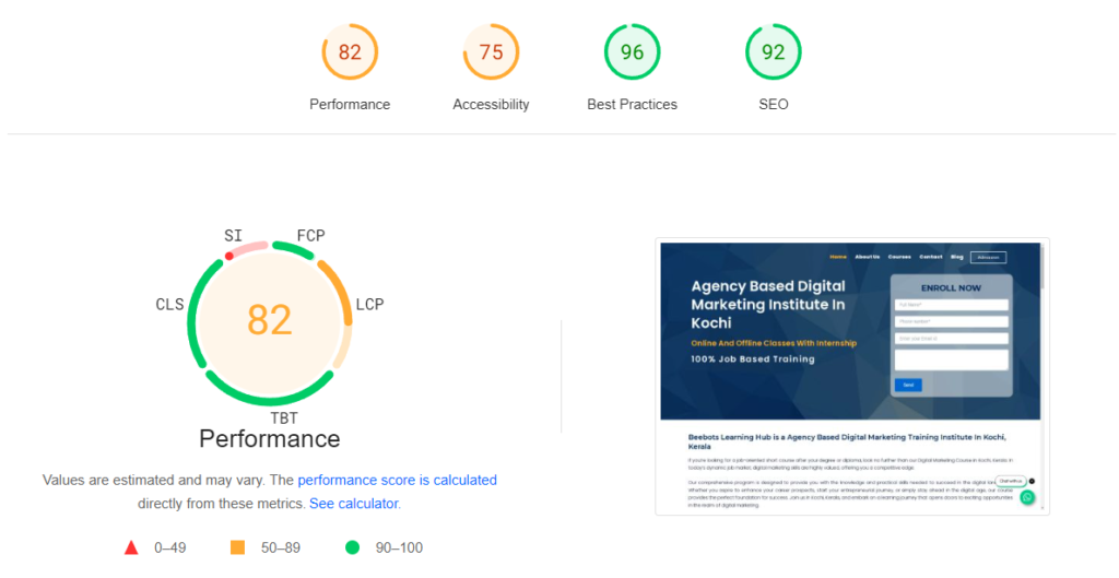
PageSpeed Insights (PSI) is a tool created by Google to help you understand how well your web pages perform on both mobile and desktop devices. It checks how quickly your page loads and provides suggestions to make it faster and better.
PSI uses two types of data: lab data and field data.
Lab Data: This data is collected in a controlled environment with specific conditions, like using a certain device and internet speed. It shows how your page performs under these set conditions. This makes it useful for identifying and fixing problems, but it might not reflect what real users experience because it is not collected from actual user visits.
Field Data: This is collected from real users as they interact with your page, providing a true picture of the user experience. It might have fewer details, but it’s great for understanding actual performance.
By using both types of data, PSI helps you see where your web page can improve, ensuring it loads quickly and works well for all users.
First Contentful Paint (FCP)
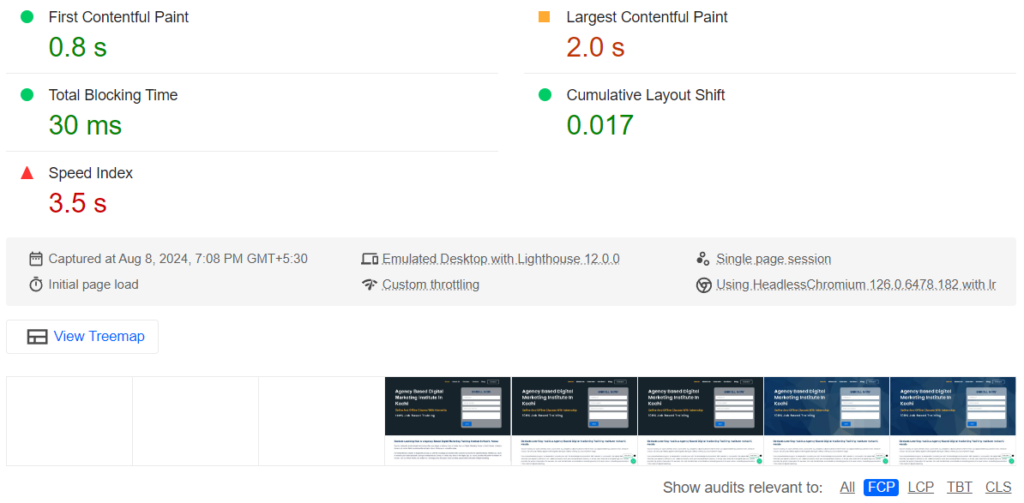
If you are opening a webpage (Eg: like a news site). When you click on a link to an article, the browser starts fetching and loading all the necessary information to display that article on your screen. The First Contentful Paint (FCP) is the exact moment when you see the very first part of that article appear on your screen. It might be the headline, a bit of text, or the first image loading in. This moment marks the start of your interaction with the webpage because you can now start reading or engaging with the content, even if other parts of the page are still loading in the background.
A good First Contentful Paint (FCP) score generally depends on the context of your website and user expectations, but as a general guideline:
- Excellent: FCP under 1 second
- Good: FCP between 1-2 seconds
- Needs Improvement: FCP between 2-3 seconds
- Poor: FCP over 3 seconds
These are rough benchmarks and can vary depending on the complexity of your website, the type of content you’re loading, and your target audience’s expectations. Faster FCP times generally lead to better user experiences and may positively impact metrics like bounce rate and user engagement.
Largest Contentful Paint (LCP)
LCP stands for Largest Contentful Paint. It is a user-centric performance metric that measures the render time of the largest content element visible in the viewport. This could be an image, a video, a large block of text, or any other significant content element. LCP helps developers and website owners understand when the main content of a page has finished rendering and becomes visible to the user.
Largest Contentful Paint Example Explanation
Imagine you are browsing a website to buy a new phone. You click on a product page to see details about a specific model. The Largest Contentful Paint (LCP) is the exact moment when the main image of that phone appears fully on your screen. It is the largest and most important visual element on the page, and LCP measures how quickly this critical content loads and becomes visible to you.
So, LCP essentially tells how fast the most significant part of the webpage (like a product image, video, or headline) shows up when you’re browsing online. This metric is important because it directly affects how quickly you can start interacting with and understanding the content on a website.
A good Largest Contentful Paint (LCP) score is generally considered to be under 2.5 seconds. This means that the largest content element on your webpage becomes fully visible to the user within 2.5 seconds after they start navigating to your page. Faster LCP times typically lead to better user experiences, as users can quickly see and interact with the main content of your webpage.
Total Blocking Time (TBT)
Total Blocking Time (TBT) is a metric that measures how much time your webpage spends being unresponsive to user interactions due to tasks running on the main thread of the browser. Here’s a clearer explanation below.
When you visit a webpage, your browser has a main thread that handles tasks like loading and displaying content, executing JavaScript code, and responding to user interactions (like clicks and scrolls).
Some tasks, especially heavy JavaScript operations or long-running processes, can block this main thread. When the main thread is blocked, the browser can’t respond to user interactions immediately. This delay is what TBT measures.
TBT is important because it affects how responsive your webpage feels to users. If there’s a high TBT, users may experience delays when trying to interact with elements on your site, leading to frustration or a perception of slow performance.
To improve TBT, developers focus on optimizing JavaScript code, reducing unnecessary tasks that block the main thread, and prioritizing critical rendering tasks to ensure that the webpage remains responsive and interactive.
Total Blocking Time (TBT) quantifies how much time users might experience delays or unresponsiveness due to tasks blocking the main thread of your webpage. Lower TBT values indicate better user experiences with smoother interactions.
Total Blocking Time (TBT) Example Explanation
Imagine you are visiting an e-commerce website to buy a new laptop. As you browse the site, you notice that when you click on a product category, there’s a delay before the page responds to your click. Here’s how TBT applies in this scenario:
Interaction Delay: When you click on a product category, the webpage starts loading and fetching information. If there are heavy scripts or tasks running on the main thread (like loading images or processing product data), these tasks can block the browser from responding immediately to your click.
Measurement: TBT measures the cumulative time during which the main thread is blocked and unable to handle user interactions smoothly. It counts how long you might experience delays in navigating the site or interacting with elements like dropdown menus or filters.
Impact on User Experience: A high TBT means you might notice delays in responsiveness, such as slower dropdown menus or delayed filtering options. These delays can frustrate users because they expect quick and smooth interactions when browsing websites.
Optimisation Strategy: To improve TBT, developers optimize scripts and prioritize critical tasks to minimize the blocking time on the main thread. This optimisation ensures that the webpage remains responsive and provides a seamless user experience without noticeable delays.
In summary, Total Blocking Time (TBT) quantifies the amount of time users experience delays or unresponsiveness due to tasks blocking the browser’s main thread. Lower TBT values indicate better performance and smoother interactions for website visitors.
Speed Index
When you enter a website on your mobile device, the Speed Index measures how quickly the visible content (above-the-fold) becomes fully loaded and visible to you without having to scroll. This metric is important because it reflects the perceived loading speed of the webpage from the user’s perspective right after they land on the page.
So, if a website has a Speed Index of 7.3 seconds on mobile, it means that it takes 7.3 seconds for the main content that appears immediately on your screen (without scrolling) to fully load and become visible. This includes elements like the headline, images, and initial text.
Optimizing for a lower Speed Index ensures that users can quickly access and engage with the core content of the webpage, leading to a better user experience and potentially higher engagement rates.
A good Speed Index score typically depends on the complexity of the webpage and user expectations, but as a general guideline:
- Excellent: Speed Index under 1000 ms
- Good: Speed Index between 1000-3000 ms
- Needs Improvement: Speed Index between 3000-6000 ms
- Poor: Speed Index over 6000 ms
These thresholds help gauge how quickly users can start interacting with the content of a web page visually, which is crucial for providing a smooth and responsive user experience.
Cumulative Layout Shift (CLS)
Cumulative Layout Shift (CLS) measures how much the content on a webpage moves around unexpectedly while the page is loading. Here’s a simpler explanation:
Unexpected Movement: When you visit a webpage, you expect elements like text, images, and buttons to stay in their place. CLS measures instances where these elements suddenly shift or move as the page loads.
User Experience Impact: Imagine reading an article and suddenly the text jumps down because an ad loads above it. This can be frustrating and confusing for users, as it might cause accidental clicks or make it hard to read.
Measurement: CLS is calculated by adding up all these unexpected shifts in elements’ positions as a fraction of the viewport (visible area of the screen). The goal is to minimise these shifts to improve user experience.
Optimisation: To reduce CLS, developers optimise how elements load on the page. For example, they can reserve space for ads beforehand, use size attributes for images, and avoid inserting new content above existing content that’s already loaded.
In essence, CLS focuses on preventing annoying layout shifts that disrupt the user experience, aiming for a webpage that loads smoothly and predictably for all users.
Cumulative Layout Shift (CLS) Example Explanation
Imagine you’re browsing a news website on your mobile phone. As you scroll down to read an article, suddenly an advertisement loads at the top of the page. This ad pushes the content you were reading further down, causing the text to shift abruptly.
- Scenario: You’re reading a news article on your phone.
- Action: An advertisement loads at the top of the page.
- Result: The article content you were reading moves down unexpectedly due to the ad loading.
- Impact: This sudden shift can confuse you, making it difficult to continue reading from where you left off. It may also cause accidental taps on the wrong content.
In this scenario, the movement caused by the advertisement loading is an example of a Cumulative Layout Shift (CLS). It disrupts the expected layout of the webpage, potentially leading to a poorer user experience. Optimizing for a lower CLS helps maintain a stable and predictable layout, ensuring a smoother browsing experience for users.
How do developers optimise to reduce Cumulative Layout Shift (CLS)?
- Define Element Sizes: Specify dimensions (width and height) for images, videos, iframes, and any other elements that may change size as they load. This ensures that the browser can allocate space correctly before content loads, preventing sudden shifts when these elements appear.
- Reserve Space for Dynamic Content: If your webpage includes elements that load dynamically (like ads or images from external sources), reserve space for them in the layout beforehand. This means leaving blank placeholders or setting the initial size of the container so that when the content loads, it doesn’t push other elements around.
- Avoid Inserting Content Above: Refrain from inserting new content above existing content that users are already viewing. When new content appears above existing content, it can push the visible content down unexpectedly. Instead, append new content below or use techniques like lazy loading to load content progressively without affecting the existing layout.
- Use CSS Transitions: If you need to animate elements or make changes to the layout, use CSS transitions or animations. These methods allow elements to change gradually, rather than abruptly, reducing the likelihood of layout shifts.
- Monitor and Adjust: Continuously monitor your webpage’s layout stability using tools like Chrome DevTools or Lighthouse. Identify elements causing layout shifts and adjust their loading behaviour accordingly to minimize CLS.
By implementing these optimization techniques, developers can significantly reduce Cumulative Layout Shift (CLS), providing users with a more stable and pleasant browsing experience where content appears predictably without sudden movements or shifts.
Website Pop-ups or Brand Ads
If a website displays brand ads or pop-ups above the main content without reserving space or managing their loading properly, it can contribute to a Cumulative Layout Shift (CLS). Here’s how:
- Unexpected Shift: When an ad or pop-up loads above the main content area without prior space reservation, it pushes the existing content down abruptly. This sudden movement can disrupt the user’s reading experience and lead to a higher CLS score.
- Impact on CLS: CLS measures the cumulative impact of all unexpected layout shifts during the webpage’s loading process. Each instance where content shifts due to dynamically loaded elements like ads or pop-ups contributes to the CLS score.
- Optimization Challenge: To optimize CLS in such cases, developers should:
- Reserve space for ads and pop-ups in the layout to avoid shifting content.
- Ensure that ads and pop-ups load in a way that minimally impacts the existing content layout.
- Use lazy loading techniques or load ads asynchronously to prevent them from affecting the initial page layout.
By addressing these issues, websites can reduce Cumulative Layout Shift (CLS) and provide a smoother, more consistent user experience, even when displaying ads or pop-ups.
How to Measure Cumulative Layout Shift (CLS) ?
CLS (Cumulative Layout Shift) is typically measured as a unitless fraction, not in seconds (s) or milliseconds (ms). It represents the proportion of the viewport (visible area of the browser window) that is affected by unexpected layout shifts during the loading process of a webpage.
For example:
- Good: CLS less than 0.1 means less than 10% of the viewport is affected by layout shifts.
- Needs Improvement: CLS between 0.1 and 0.25 means between 10% and 25% of the viewport is affected.
- Poor: CLS greater than 0.25 means more than 25% of the viewport is affected.
- These thresholds are used to evaluate and improve the stability of webpage layouts, ensuring a smoother and more predictable user experience.
Top 10 Tips to Improve Website Page Speed
Improving your website’s speed is important for providing a better experience for your visitors. Here are ten simple tips to help you achieve faster loading times:
- Optimise Your Images
Large images can slow down your website. By resizing and compressing images, you can make them load more quickly. Also, setting specific dimensions for each image can help your page display faster. - Embed Videos Instead of Uploading
Videos can take up a lot of space and slow your site down. Instead of uploading them directly, use a platform like YouTube to host your videos and embed them on your site. This makes your pages load faster. - Minimise Redirects
Every time a page redirects to another, it adds extra loading time. Reducing the number of redirects can help your site respond more quickly. - Choose a Speed-Optimised Theme
Some website themes are designed to load faster. Choosing a lightweight and responsive theme can significantly improve your page speed. - Enable Browser Caching
Caching allows your visitors’ browsers to store files locally, so they don’t need to reload everything each time they visit. This speeds up the experience for returning users. - Minify Your Code
Cleaning up your website’s code by removing unnecessary spaces and characters can make your pages load faster. This applies to CSS, JavaScript, and HTML files. - Use a Content Delivery Network (CDN)
A CDN stores copies of your site’s files on servers around the world. When someone visits your site, they receive the data from the closest server, speeding up load times. - Enable File Compression
Compressing your site’s files can reduce their size, which makes them faster to download. Tools like Gzip can help with this. - Defer Non-Essential Resources
Some CSS and JavaScript files aren’t needed right away. By deferring them, your site can load the important parts first, which improves the overall speed. - Implement Lazy Loading for Images
With lazy loading, images only load when they are about to appear on the screen. This reduces the initial load time and makes your site feel faster to users.
Conclusion
In this guide, we covered everything you need to know about Google Page Speed Insights reports with examples and shared useful tips to improve your website’s speed. By applying these techniques, you can make your site faster and more user-friendly.
For more information on SEO and digital marketing, visit Beebots Learning Hub. We offer training and resources to help you succeed online. Check out our website for more SEO-related blogs and continue learning with us.

